Shaun Verma
More By The Author
Back
B2B SaaS Top-Line Metrics: Getting More Out of Revenue Measurements
Shaun Verma | June 25, 2019| 1 min. read

Every company’s context is going to be different and there are many potential paths to top-line growth. The right set of revenue metrics will help you better understand your current position and identify the right growth levers to pull for your company. Some things you might be thinking about… Must you increase the size of your customer base? Do you need to make more money out of each customer? If the latter, should you be trying to increase the value of each customer with new or better products and services, or should you be focused on retaining customers for longer?
Below are some of the key revenue metrics you should be continuously tracking (preferably with information on product, segment, etc). If you’d let to get into some examples of how these metrics are used to define strategy at companies like yours – check out our other blog post on Growing Revenue Through Evidence-Based Product Strategy.
Annual Recurring Revenue (ARR) – Consists of all subscription revenues that take place on a recurring, periodic basis; it excludes any one-time fees or upfront costs that are charged to customers (e.g., onboarding, professional services). ARR can also be calculated by multiplying Monthly Recurring Revenue (MRR) by twelve (e.g., if a client pays a $5K per month subscription, ARR from that client is $60K and you would add all clients together to get company level ARR). ARR is a critical high-level metric for tracking growth and evaluating product performance for SaaS companies. Comparing revenue growth rates in different periods will allow you to show rapid scaling. Ideally, you’ll also be able to segment your ARR into customer industry, size, or geography.
Annual Contract Value (ACV) – Measures the value of all contracts over a year-long period. ACV is used in cases where revenues are collected on a contractual basis (as opposed to a subscription basis). ACV is calculated by taking overall contract value and dividing by the length of contract, in years (e.g., if a customer commits to a 3-year contract at $180K, then your ACV is $60K for that customer – to get your total ACV, you’d add up all customer contracts for the same period). Whereas an ARR snapshot assumes continued customer subscription, looking at ACV a few years into the future can show how much revenue is already locked in.
If you are interested in how ARR and ACV differ and interact please read more here.
Lifetime Value (LTV) – Measures the amount of money that you expect to make from a customer throughout the time they are involved in your business. Since it points towards expected future revenues, it is a leading indicator for sustainable revenue growth. The way LTV is calculated differs from company to company, but at a high level it is: ARPU (Average Revenue Per User) divided by Logo Churn. Figuring out LTV can help you benchmark the success of your business and serves as a key leading indicator for future revenue expectations. Depending on the stage of your company, LTV will have different levels of importance for your organization. However, your job as a product leader is the understand all the pieces that play a part here in your stage of growth (i.e., acquisition vs. retention) so that LTV is poised to be optimized at the right time.
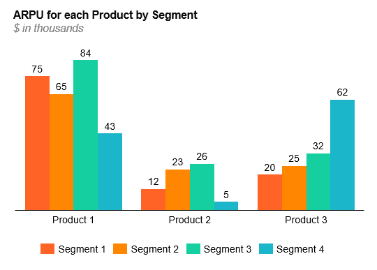
Average Revenue Per User (ARPU) – Signifies the average revenue per logo. It is simply calculated by taking overall revenue dividing it by the number of logos. Deeper insight can be gleaned by calculating ARPU at the product level and/or for different segments within a customer base. These ARPU calculations can help you understand the value of your products to different users. An example of how this might be useful in a multi-product company is below, note that Segment 4 doesn’t buy Product 2 nearly as much as they purchase Product 3.
Average Selling Price (ASP) – Represents the average revenue generated per new deal signed within a given time period. ASP should be compared across time periods to understand whether you are generating successfully generating more value with your R&D. Declining ASPs can indicate commoditization of your product or increased competition. Like ARPU, ASP should be explored by segment, and, over time, ASP will be a leading indicator of how your ARPU is going to trend.
Logos – Measures the number of distinct customers you serve (i.e., logos means companies). Often, metrics are displayed in either a dollar or logo format (e.g., logo growth, logo retention). Displaying metrics in terms of both dollars and logos will help you identify whether you need to focus on logo acquisition/retention or increasing LTV.
Retention – Measures how much of your revenue or customer base is staying with you on a periodic basis. This metric is measured and displayed in four ways: Gross and Net Dollar Retention, and Gross and Net Logo Retention (Churn = 1 – Gross Retention). Each of these is calculated differently, and it is critical to understand the difference and calculate each. This will help answer questions like: Where are we losing money? Where are we losing customers? Is revenue growth from our current customers outpacing revenues loss? If retention drops, or churn rises, you should make it a top strategic priority to understand why you are losing money or customers.
Churn – Measures how much of your revenue or customer base is leaving you on a period basis. It is the inverse of retention (i.e., Churn = 1 – Gross Retention).
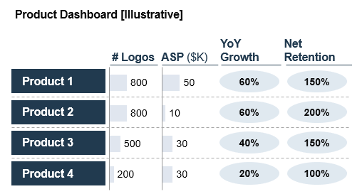
An example of how you would tie together some of these metrics for a multi-product company is below:
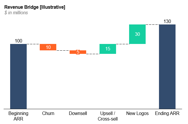
Revenue Movements: Acquisition, Cross-sell/Upsell, Downsell, and Revenue Churn – All collectively display the change in recurring revenue over a period (e.g., month, quarter, year) in clear, actionable buckets. Each of these movements contributes to a change in recurring revenue from the beginning of the period to the end of the period and can help track successes or quickly identify opportunities for improvement. Displaying your Revenue Movements in a clear and simple format can help strategic leaders identify where the company should focus for future growth: Increasing logo acquisition through selling? Increasing cross-sell or upsell within customer base by adding features or increasing ASP? Addressing downsell through pricing & packaging? Addressing churn? It is useful to visualize revenue movements as a “Revenue Bridge” on a Waterfall chart as down below:
Once you have organized your data by breaking Recurring Revenue down to its subsequent parts, then you can ‘cut’ (i.e., pivot) the data in many ways to produce data visualizations that clearly show growth trends and patterns of where value might lie. Understanding this data will answer product-market fit questions like: Which product is performing best? In what segments do we win? Is churn a significant issue? Where are we losing logos? Where could we better be serving our customers?
As previously mentioned, these metrics should be rolled up directly from your customer data. To better understand each of these metrics, let’s look at how an imaginary company’s customer base and contracts might evolve over a year:
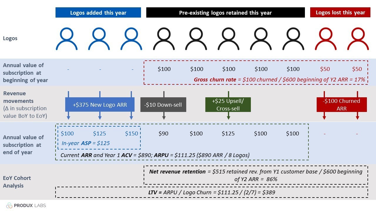
Now keep in mind this small sample size does not allow the data manipulations to show each of these by industry segment, by use case, by company size, or by product. When applied to companies ranging in $10M to $1B in annual recurring revenues, basic metric formulas become much more complex, and that much more valuable. For example, what sticks out to you in the graphic above? Any particular metric? Depending on context, these percentages will mean different things, but if you’re a $20M ARR company then 17% churn and 86% Net Dollar Retention are reasons enough to nix a product line.
We hope this was helpful! Be sure to check out Growing Revenue Through Evidence-Based Product Strategy to learn data-driven tactics to achieve top-line growth.